
滑动选择文本内容的组件。
说明
该组件从API Version 8开始支持。后续版本如有新增内容,则采用上角标单独标记该内容的起始版本。
子组件
无
接口
TextPicker(options?: TextPickerOptions)
根据range指定的选择范围创建文本选择器。
元服务API: 从API version 11开始,该接口支持在元服务中使用。
系统能力: SystemCapability.ArkUI.ArkUI.Full
参数:
| 参数名 | 类型 | 必填 | 说明 |
|---|---|---|---|
| options | [TextPickerOptions] | 否 | 配置文本选择器的参数。 |
TextPickerOptions对象说明
元服务API: 从API version 11开始,该接口支持在元服务中使用。
系统能力: SystemCapability.ArkUI.ArkUI.Full
| 名称 | 类型 | 必填 | 说明 |
|---|---|---|---|
| range | string[] | string[] []10+ | [Resource] |
| selected | number | number[]10+ | 否 |
| value | string | string[]10+ | 否 |
TextPickerRangeContent10+对象说明
元服务API: 从API version 11开始,该接口支持在元服务中使用。
系统能力: SystemCapability.ArkUI.ArkUI.Full
| 名称 | 类型 | 必填 | 说明 |
|---|---|---|---|
| icon | string | [Resource] | 是 |
| text | string | [Resource] | 否 |
TextCascadePickerRangeContent10+对象说明
元服务API: 从API version 11开始,该接口支持在元服务中使用。
系统能力: SystemCapability.ArkUI.ArkUI.Full
| 名称 | 类型 | 必填 | 说明 |
|---|---|---|---|
| text | string | [Resource] | 是 |
| children | [TextCascadePickerRangeContent][] | 否 | 联动数据。 |
DividerOptions12+对象说明
元服务API: 从API version 12开始,该接口支持在元服务中使用。
系统能力: SystemCapability.ArkUI.ArkUI.Full
| 名称 | 类型 | 必填 | 说明 |
|---|---|---|---|
| strokeWidth | [Dimension] | 否 | 分割线的线宽(默认单位vp),也可指定单位为px,不支持"百分比"类型。 |
| startMargin | [Dimension] | 否 | 分割线与TextPicker侧边起始端的距离(默认单位vp),也可指定单位为px,不支持“百分比”类型。 |
| endMargin | [Dimension] | 否 | 分割线与TextPicker侧边结束端的距离(默认单位vp),也可指定单位为px,不支持“百分比”类型。 |
| color | [ResourceColor] | 否 | 分割线的颜色。 |
属性
除支持[通用属性]外,还支持以下属性:
defaultPickerItemHeight
defaultPickerItemHeight(value: number | string)
设置Picker各选择项的高度。
元服务API: 从API version 11开始,该接口支持在元服务中使用。
系统能力: SystemCapability.ArkUI.ArkUI.Full
参数:
| 参数名 | 类型 | 必填 | 说明 |
|---|---|---|---|
| value | number | string | 是 |
disappearTextStyle10+
disappearTextStyle(value: PickerTextStyle)
设置所有选项中最上和最下两个选项的文本颜色、字号、字体粗细。
元服务API: 从API version 11开始,该接口支持在元服务中使用。
系统能力: SystemCapability.ArkUI.ArkUI.Full
参数:
| 参数名 | 类型 | 必填 | 说明 |
|---|---|---|---|
| value | [PickerTextStyle] | 是 | 所有选项中最上和最下两个选项的文本颜色、字号、字体粗细。默认值:{color: ‘#ff182431’,font: {size: ‘14fp’,weight: FontWeight.Regular}} |
textStyle10+
textStyle(value: PickerTextStyle)
设置所有选项中除了最上、最下及选中项以外的文本颜色、字号、字体粗细。
元服务API: 从API version 11开始,该接口支持在元服务中使用。
系统能力: SystemCapability.ArkUI.ArkUI.Full
参数:
| 参数名 | 类型 | 必填 | 说明 |
|---|---|---|---|
| value | [PickerTextStyle] | 是 | 所有选项中除了最上、最下及选中项以外的文本颜色、字号、字体粗细。默认值:{color: ‘#ff182431’,font: {size: ‘16fp’,weight: FontWeight.Regular}} |
selectedTextStyle10+
selectedTextStyle(value: PickerTextStyle)
设置选中项的文本颜色、字号、字体粗细。
元服务API: 从API version 11开始,该接口支持在元服务中使用。
系统能力: SystemCapability.ArkUI.ArkUI.Full
参数:
| 参数名 | 类型 | 必填 | 说明 |
|---|---|---|---|
| value | [PickerTextStyle] | 是 | 选中项的文本颜色、字号、字体粗细。默认值:{color: ‘#ff007dff’,font: {size: ‘20vp’,weight: FontWeight.Medium}} |
selectedIndex10+
selectedIndex(value: number | number[])
设置默认选中项在数组中的索引值,优先级高于options中的选中值。单列数据选择器使用number类型。多列、多列联动数据选择器使用number[]类型。
元服务API: 从API version 11开始,该接口支持在元服务中使用。
系统能力: SystemCapability.ArkUI.ArkUI.Full
参数:
| 参数名 | 类型 | 必填 | 说明 |
|---|---|---|---|
| value | number | number[] | 是 |
canLoop10+
canLoop(value: boolean)
设置是否可循环滚动。
元服务API: 从API version 11开始,该接口支持在元服务中使用。
系统能力: SystemCapability.ArkUI.ArkUI.Full
参数:
| 参数名 | 类型 | 必填 | 说明 |
|---|---|---|---|
| value | boolean | 是 | 是否可循环滚动。true:可循环,false:不可循环。默认值:true |
divider12+
divider(value: DividerOptions | null)
设置分割线样式,不设置该属性则按“默认值”展示分割线。
startMargin + endMargin 超过组件宽度后startMargin和endMargin会被置0。
元服务API: 从API version 12开始,该接口支持在元服务中使用。
系统能力: SystemCapability.ArkUI.ArkUI.Full
参数:
| 参数名 | 类型 | 必填 | 说明 |
|---|---|---|---|
| value | [DividerOptions] | null | 是 |
gradientHeight12+
gradientHeight(value: Dimension)
设置渐隐效果高度,不设置该属性则显示默认渐隐效果。
元服务API: 从API version 12开始,该接口支持在元服务中使用。
系统能力: SystemCapability.ArkUI.ArkUI.Full
参数:
| 参数名 | 类型 | 必填 | 说明 |
|---|---|---|---|
| value | [Dimension] | 是 | 内容区上下边缘的渐隐高度(支持百分比,100%为TextPicker高度的一半即最大值),设置为0时不显示渐隐效果,负数等非法值显示默认渐隐效果。默认值为36vp。 |
说明
该组件不建议开发者在动效过程中修改属性数据。
事件
除支持[通用事件]外,还支持以下事件:
onAccept(deprecated)
onAccept(callback: (value: string, index: number) => void)
点击弹窗中的“确定”按钮时触发该回调。该事件仅在[文本滑动选择器弹窗]中生效。
从API version 10开始废弃。
系统能力: SystemCapability.ArkUI.ArkUI.Full
参数:
| 参数名 | 类型 | 必填 | 说明 |
|---|---|---|---|
| value | string | 是 | 当前选中项的文本。 |
| index | number | 是 | 当前选中项的索引值。 |
onCancel(deprecated)
onCancel(callback: () => void)
点击弹窗中的“取消”按钮时触发该回调。该事件仅在[文本滑动选择器弹窗]中生效。
从API version 10开始废弃。
系统能力: SystemCapability.ArkUI.ArkUI.Full
onChange
onChange(callback: (value: string | string[], index: number | number[]) => void)
滑动选中TextPicker文本内容后,触发该回调。当显示文本或图片加文本列表时,value值为选中项中的文本值,当显示图片列表时,value值为空。
元服务API: 从API version 11开始,该接口支持在元服务中使用。
系统能力: SystemCapability.ArkUI.ArkUI.Full
参数:
| 参数名 | 类型 | 必填 | 说明 |
|---|---|---|---|
| value | string | string[]10+ | 是 |
| index | number | number[]10+ | 是 |
示例
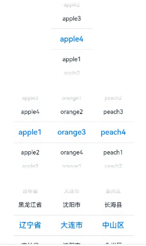
示例1(设置选择器列数)
该示例通过配置range实现单列或多列文本选择器。
// xxx.ets
class bottom {
  bottom:number = 50
}
let bott:bottom = new bottom()
@Entry
@Component
struct TextPickerExample {
  private select: number = 1
  private apfruits: string[] = ['apple1', 'apple2', 'apple3', 'apple4']
  private orfruits: string[] = ['orange1', 'orange2', 'orange3', 'orange4']
  private pefruits: string[] = ['peach1', 'peach2', 'peach3', 'peach4']
  private multi: string[][] = [this.apfruits, this.orfruits, this.pefruits]
  private cascade: TextCascadePickerRangeContent[] = [
    {
      text: '辽宁省',
      children: [{ text: '沈阳市', children: [{ text: '沈河区' }, { text: '和平区' }, { text: '浑南区' }] },
        { text: '大连市', children: [{ text: '中山区' }, { text: '金州区' }, { text: '长海县' }] }]
    },
    {
      text: '吉林省',
      children: [{ text: '长春市', children: [{ text: '南关区' }, { text: '宽城区' }, { text: '朝阳区' }] },
        { text: '四平市', children: [{ text: '铁西区' }, { text: '铁东区' }, { text: '梨树县' }] }]
    },
    {
      text: '黑龙江省',
      children: [{ text: '哈尔滨市', children: [{ text: '道里区' }, { text: '道外区' }, { text: '南岗区' }] },
        { text: '牡丹江市', children: [{ text: '东安区' }, { text: '西安区' }, { text: '爱民区' }] }]
    }
  ]

  build() {
    Column() {

      TextPicker({ range: this.apfruits, selected: this.select })
        .onChange((value: string | string[], index: number | number[]) => {
          console.info('Picker item changed, value: ' + value + ', index: ' + index)
        }).margin(bott)

      TextPicker({ range: this.multi })
        .onChange((value: string | string[], index: number | number[]) => {
          console.info('TextPicker 多列:onChange ' + JSON.stringify(value) + ', ' + 'index: ' + JSON.stringify(index))
        }).margin(bott)

      TextPicker({ range: this.cascade })
        .onChange((value: string | string[], index: number | number[]) => {
          console.info('TextPicker 多列联动:onChange ' + JSON.stringify(value) + ', ' + 'index: ' + JSON.stringify(index))
        })
    }
  }
}

- 1
- 2
- 3
- 4
- 5
- 6
- 7
- 8
- 9
- 10
- 11
- 12
- 13
- 14
- 15
- 16
- 17
- 18
- 19
- 20
- 21
- 22
- 23
- 24
- 25
- 26
- 27
- 28
- 29
- 30
- 31
- 32
- 33
- 34
- 35
- 36
- 37
- 38
- 39
- 40
- 41
- 42
- 43
- 44
- 45
- 46
- 47
- 48
- 49
- 50
- 51
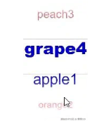
示例2(设置文本样式)
该示例通过配置disappearTextStyle、textStyle、selectedTextStyle实现文本选择器中的文本样式。
// xxx.ets
@Entry
@Component
struct TextPickerExample {
  private select: number = 1
  private fruits: string[] = ['apple1', 'orange2', 'peach3', 'grape4']

  build() {
    Column() {
      TextPicker({ range: this.fruits, selected: this.select })
        .onChange((value: string | string[], index: number | number[]) => {
          console.info('Picker item changed, value: ' + value + ', index: ' + index)
        })
        .disappearTextStyle({color: Color.Red, font: {size: 15, weight: FontWeight.Lighter}})
        .textStyle({color: Color.Black, font: {size: 20, weight: FontWeight.Normal}})
        .selectedTextStyle({color: Color.Blue, font: {size: 30, weight: FontWeight.Bolder}})
    }.width('100%').height('100%')
  }
}
- 1
- 2
- 3
- 4
- 5
- 6
- 7
- 8
- 9
- 10
- 11
- 12
- 13
- 14
- 15
- 16
- 17
- 18
- 19
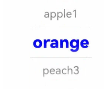
示例3(设置无分割线样式)
该示例通过配置divider为null实现无分割线样式的文本选择器。
// xxx.ets
@Entry
@Component
struct TextPickerExample {
  private select: number = 1
  private fruits: string[] = ['apple1', 'orange2', 'peach3', 'grape4']

  build() {
    Column() {
      TextPicker({ range: this.fruits, selected: this.select })
        .onChange((value: string | string[], index: number | number[]) => {
          console.info('Picker item changed, value: ' + value + ', index: ' + index)
        })
        .disappearTextStyle({color: Color.Red, font: {size: 15, weight: FontWeight.Lighter}})
        .textStyle({color: Color.Black, font: {size: 20, weight: FontWeight.Normal}})
        .selectedTextStyle({color: Color.Blue, font: {size: 30, weight: FontWeight.Bolder}})
        .divider(null)
    }.width('100%').height('100%')
  }
}
- 1
- 2
- 3
- 4
- 5
- 6
- 7
- 8
- 9
- 10
- 11
- 12
- 13
- 14
- 15
- 16
- 17
- 18
- 19
- 20

示例4(设置分割线样式)
该示例通过配置divider的DividerOptions类型实现分割线样式的文本选择器。
// xxx.ets
@Entry
@Component
struct TextPickerExample {
  private select: number = 1
  private fruits: string[] = ['apple1', 'orange2', 'peach3', 'grape4']

  build() {
    Column() {
      TextPicker({ range: this.fruits, selected: this.select })
        .onChange((value: string | string[], index: number | number[]) => {
          console.info('Picker item changed, value: ' + value + ', index: ' + index)
        })
        .disappearTextStyle({color: Color.Red, font: {size: 15, weight: FontWeight.Lighter}})
        .textStyle({color: Color.Black, font: {size: 20, weight: FontWeight.Normal}})
        .selectedTextStyle({color: Color.Blue, font: {size: 30, weight: FontWeight.Bolder}})
        .divider({
          strokeWidth: 10,
          color: Color.Red,
          startMargin: 10,
          endMargin: 20
        } as DividerOptions)
    }.width('100%').height('100%')
  }
}
- 1
- 2
- 3
- 4
- 5
- 6
- 7
- 8
- 9
- 10
- 11
- 12
- 13
- 14
- 15
- 16
- 17
- 18
- 19
- 20
- 21
- 22
- 23
- 24
- 25

示例5(设置渐隐效果)
该示例通过gradientHeight自定义TextPicker的渐隐效果高度。
// xxx.ets
@Entry
@Component
struct TextPickerExample {
  private select: number = 1
  private fruits: string[] = ['apple1', 'orange2', 'peach3', 'grape4']

  build() {
    Column() {
      TextPicker({ range: this.fruits, selected: this.select })
        .onChange((value: string | string[], index: number | number[]) => {
          console.info('Picker item changed, value: ' + value + ', index: ' + index)
        })
        .disappearTextStyle({color: Color.Red, font: {size: 15, weight: FontWeight.Lighter}})
        .textStyle({color: Color.Black, font: {size: 20, weight: FontWeight.Normal}})
        .selectedTextStyle({color: Color.Blue, font: {size: 30, weight: FontWeight.Bolder}})
        .gradientHeight(100)
    }.width('100%').height('100%')
  }
}
- 1
- 2
- 3
- 4
- 5
- 6
- 7
- 8
- 9
- 10
- 11
- 12
- 13
- 14
- 15
- 16
- 17
- 18
- 19
- 20

 微信名片
微信名片

评论记录:
回复评论: